
What Are the Best Practices for Digital Signage in 2025?
Digital signage is a powerful marketing tool, but if it's not used correctly, it can be ineffective or, even worse, damaging to your brand.
To get the most out of your digital signage, you need more than just good content. You need a strategy. From setting goals to testing performance, these nine best practices will help ensure your screens make a meaningful impact.
Answer the following questions to help you get the most out of your digital signage:
1. How Do You Set Clear Goals for your Digital Signage?
Start with why. Before creating any content, define what success looks like.
The first step to creating digital signage content is setting goals for your project. If there isn't a clear direction, it will be difficult to make an informed decision, so being specific about the outcome beforehand is essential.
Here are ways to do this:
- Set objectives and goals: What are you trying to achieve with your content? Do you want to inform, educate, or entertain your audience? How will digital signage content help you achieve your goals?
- Establish your metrics: How will you measure the success of your signage? What are your KPIs? What is your timeline for completing these metrics?
- Know your audience: Who will be seeing your digital signage? What are their needs and wants? How often will they view your messaging?
- Determine your location: Where will your content be displayed, and how will this help you achieve your goals? How long will viewers spend looking at them?
- Evaluate resources: What is your budget? How and who will manage and update content? What technologies will we use?
Keep in mind that you should set realistic goals, as overly ambitious goals often leave you disappointed.
2. What Content Strategy Works Best for your Digital Signage?
Now that you've established your actionable goals, you'll need to take the time to plan out your content strategy to ensure your content is relevant, engaging, and effective.
To do this, you'll need to determine which type of content you want to create: static or dynamic.
- Static content: This type of content is put in place and left to run without any changes. Examples of static content include digital posters, whitepapers, billboards, and looped video content.
- Dynamic content: This type of content is designed for interactive experiences and allows information to be changed in response to specific inputs. Dynamic content includes interactive kiosks, emails, wayfinding boards, and proximity displays.
While it's possible to achieve simple static content with common software like Microsoft PowerPoint, you'll need to invest in advanced digital software to create interactive content that's genuinely engaging and improves your business outcomes.
You'll also need to determine who's going to manage your content. Will you use internal resources or utilize external solutions? You'll need to consider:
- Who's creating your content?
- How often will it be updated?
- What level of expertise is required to manage your content?
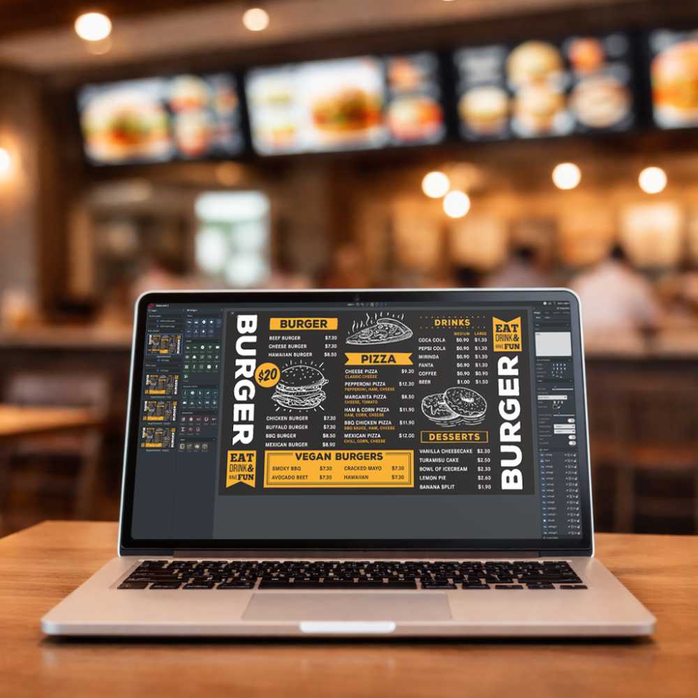
Many businesses use content management solutions, like Wallboard, that come equipped with various features to help them effectively create, manage, and set schedules for their digital signage.
Here's an example of how Wallboard uses widgets to help automate digital signage content:
3. How Do You Make Digital Signage ADA-Compliant?
When creating digital signage content, it's essential to guarantee that your content is accessible to everyone, including those with disabilities.
The Americans with Disabilities Act (ADA) requires businesses to provide equal access to goods, services, and information for all individuals. Digital signage content should also be accessible to those with hearing, visual, and physical impairments.
Here are a few tips for ADA-compliant interactive digital signage:
- Interactive/play components: Any buttons, keyboards, or other manipulative elements must be no higher than 44 inches. There are advanced recommendations based on obstructed and unobstructed displays.
- Speech output: All information and functionality on displays must have the option to be speech enabled.
- Text size: The character height of the letter "I" determines the viewing distance. For example, the minimum character height needed to view a display at 72 inches is 5/8 inch.
- Style: Sans-serif fonts are the preferred font style for ADA signs.

4. What Are Some Key Digital Signage Design Tips?
Design for clarity. Here’s how to make your signage pop and keep it legible.
Text
First, the text should be legible from a distance and should be large enough to be seen clearly - a font size of 20-30 points is recommended for easy viewing from 7-10 feet. Try reading your digital signage from varying distances that you expect your audience to see them at.
Avoid using more than two or three fonts in your design. Too many fonts can make your content look cluttered. Stick with one or two main fonts and use additional fonts sparingly for emphasis.
Whenever possible, let your main message appear in the largest font size and in a font that is easy to read (sans-serif). Additionally, important information should use bolded fonts as it helps it stand out.
Implement the 3x5 text rule - each screen's content should have either a maximum of three lines of text with five words per line, or five lines of text with three words per line to enhance readability and ensure that your messages are easily digestible and impactful, even when viewed quickly.

Contrast
Your digital signage content should have enough contrast to be easily visible. This means you'll want to use light colors on a dark background or vice versa.
Avoid using similar colors next to each other, as this can make your content more difficult to read.
Colors
The colors you use in your digital signage content should be eye-catching and attention-grabbing.
Bright colors are typically the best choice for this purpose. However, you'll want to avoid using too many colors in one space, as this can be overwhelming for viewers.
Typically, designers follow the 60-30-10 rule, which means the dominant color will be used 60% of the time, the secondary color will be used 30% of the time, and the accent color will be used 10% of the time.
Visuals
Visuals help break up large blocks of text and add interest to your content. However, you will want to make sure that the visuals you use are relevant to your brand and message.
Remember, the majority of your audience absorbs content from left to right. It is best to place your image on the left side of your design because it is easier for your audience to process images if they are left-aligned and leave your copy on the right.
You'll also need to consider image ratios when you include visuals. While some devices have their own specific ratios, the most common ones you'll need are:
- Horizontal: The standard ratio for this aspect is 16:9 or 1920 by 1080 pixels.
- Vertical: The standard ratio for this aspect is 9:16 or 1080 by 1920 pixels.

5. How Do You Adapt Digital Signage to Different Locations?
The best digital signage content is designed to meet the specific needs of the audience at each point of interaction.
Your content should be tailored to the specific situation to maximize its impact, whether it's a transit stop, a retail store, or a waiting room.
There are three different types of viewing patterns based on location.
6. How Can You Write Better Headlines and CTAs?
Your digital signage content needs to be eye-catching and informative if you want it to stand out from the rest. One way to do this is by using an attention-grabbing headline. Here are some tips on writing engaging headlines:
- Be creative: Think outside the box when it comes to your headline and come up with something that will make people want to read your content.
- Use numbers: People are 36% more likely to read headlines that include numbers because they're easy to understand and digest.
- Ask a question: Asking a question in your headline is a great way to engage your audience and get them interested in what you have to say.
You'll also need a clear and compelling CTA that will appeal to your audience. It should be relevant and easy for them to understand. It shouldn't contain unnecessary jargon or technical language to accomplish this goal.
Remember, this is your last chance to trigger the desired action, whether it's completing a purchase or visiting your website. Don't miss out on this opportunity by not having the right CTA.

7. How Do You Keep Your Messaging Clear and Concise?
It is important to keep your message clear and concise when creating digital signage content. This will ensure that your audience understands your message and can take the appropriate action.
The 3x5 rule is one way to accomplish this. This rule simply states that your content should contain three lines with five words or five lines with three words.
Alternatively, you can use an information hierarchy to convey your message. This method calls for a large heading, a smaller copy, and a medium-sized CTA. It will look something like this:

8. How Often Should You Rotate Digital Signage Content?
To create a proper schedule for your messaging loops, you'll need to consider the location your content will be displayed for you to set the appropriate times. You'll want to convey short messages (roughly 5-8 seconds long) in a location where your audience is in transit.
Remember, your audience will need to view your message a few times before it really sinks in.
You'll also want to make sure you update your content to stay fresh and relevant. Determine how often you want to change your messages (daily, weekly, monthly), and don't underestimate the power of alternating the color scheme or background.
9. How Can You Test and Improve Digital Signage Performance?
Now that you've got your digital signage content up and running, it's time to make sure it's effective. Here are some ways to test, monitor, and improve your digital signage content:
- Test your content with different audiences, like friends, family, and colleagues, to get their feedback.
- Monitor your content's performance by keeping track of how often your content is viewed and for how long.
- Ask your customers or audience for their feedback using surveys, polls, or even just informal conversations.
- Use analytics to see how your content is performing and make changes to the frequency or the time of day that it's played.

What Hardware Do You Need for Effective Digital Signage?
Choosing the right hardware for your digital signage can really make or break its effectiveness and how your content dispays, and here's why it matters:
- First up, think about the space where you'll set up your digital signage. Whether it's a cozy boutique, restaurant or a sprawling conference hall, figuring out where to place your screens and how many you’ll need is crucial for catching eyes and delivering your message.
- You’ll need a few key pieces of equipment: the screens themselves, media players, and some mounts or stands to keep everything in place.
- Now, what you’re showing and where it’s being shown should guide your hardware choices. Whether it’s crisp ads on a gorgeous 8K display, promotions on an ePaper display, or interactive info on tablets and kiosks, matching your tech to your content is key.
- Pixel ratio is a bit technical, but getting it right is a game-changer. This is all about making sure your images look sharp and not pixelated, which really depends on how big your screens are and how close your viewers get.
- Last but not least, quality matters. High-quality displays and media players not only last longer but also support richer, more dynamic content, ensuring that your digital signage looks great and runs smoothly.
So, picking the right hardware isn't just a technical decision—it’s about making sure your digital signage works as hard as you do on your quality content!
Digital Signage Best Practices FAQ's
What is the 3x5 rule in digital signage?
It’s a content design rule: use 3 lines of 5 words or 5 lines of 3 words for easier readability.
What makes digital signage ADA-compliant?
Compliance includes proper screen height, legible fonts, and accessibility features like speech output or tactile input.
How often should I update my digital signage content?
At least monthly for static environments; weekly or daily for dynamic, high-traffic locations.
What is the best font for digital signage?
Sans-serif fonts like Helvetica or Arial are most legible at a distance.
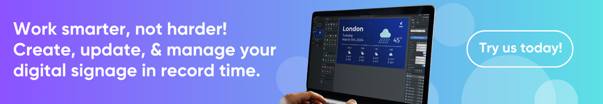
Take Your Digital Signage to the Next Level with Wallboard
Ready to turn these best practices into action? Wallboard's no-code CMS lets you create, schedule, and manage engaging digital signage content across any number of screens—no tech team required.
From dynamic templates and real-time data integrations to advanced scheduling and analytics, Wallboard makes it easy to optimize every screen in your network.
Book a demo today and see what your signage could really do.
Get in touch with us and schedule a demo.
.png)